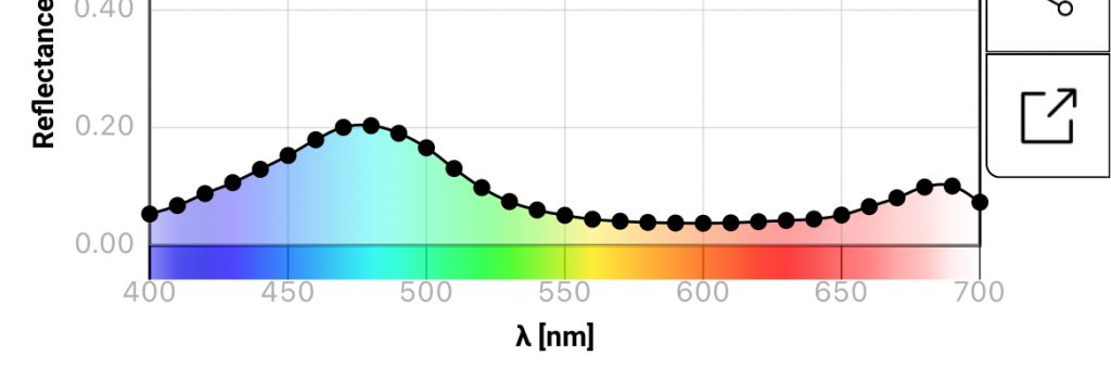
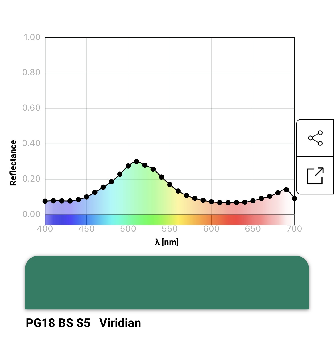
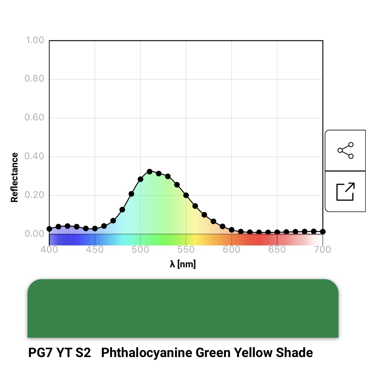
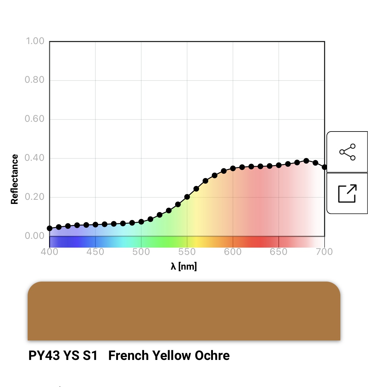
Spectral profiles reveal the relative proportions of spectra that create the colours of oil paints. You can use spectral images to help identify combinations of pigments that will probably mix together to create the colours you need.
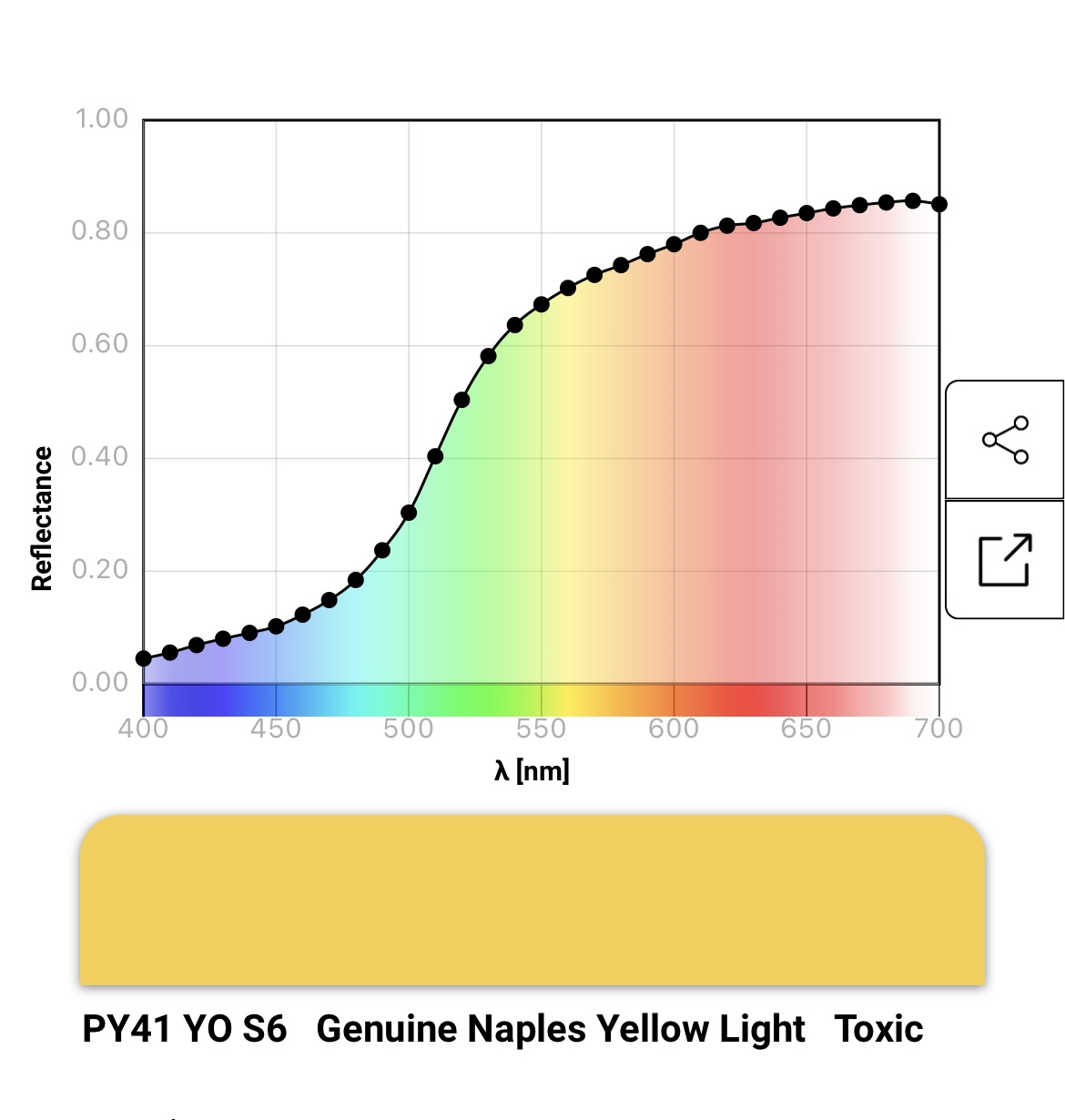
For example the profile for Naples Yellow, shows the spectral proportions that make a warm golden colour, so if you want warm yellow earth tones these are the sort of proportions you are looking for if you combine two or more pigments together.
Screenshot
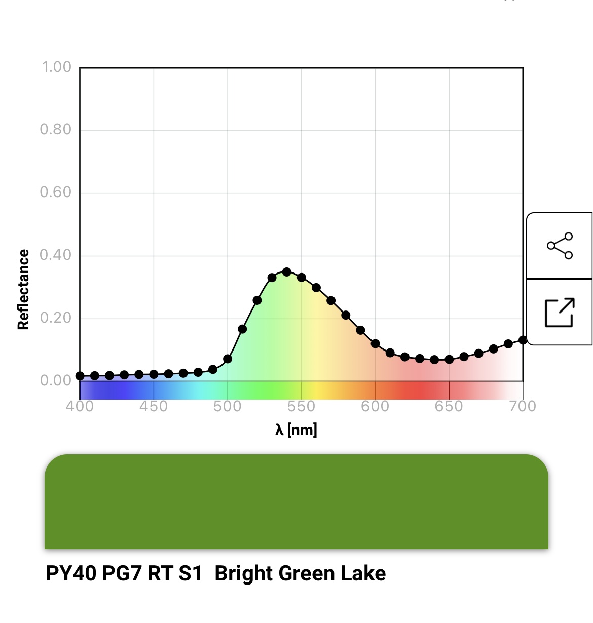
If you are looking to change colours like a Bright Green then mixing in small traces of red will take the colour towards mud, whereas adding traces of blue e.g. pthalo blue PB15.3 or PB29 Ultramarine will shift it towards blue green. Some pigments such as PV19, come in both the Red and Blue shades. PV19B will mix nicely with PB29 Ultramarine Blue, and PV19R with Cadmium Red.
Screenshot
Screenshot
Screenshot
Screenshot
The above examples of green show the subtle effects of changes to the proportions of yellow, red and blue relative to green.
It’s useful to be able to see that each single pigment has its own special spectral characteristics. It is precisely those traits that determine the colours you can create from them.
The Legend accompanying each spectral image identifies
CI index number of the pigment, e.g. PG7 Shade or bias e.g. Red, Blue, Green, Yellow etc Opacity e.g. Transparent, Semi-opaque, Opaque Common name of paint e.g. Yellow Ochre Toxicity if identified e.g. Toxic
Legend: CI Index Colour ; Shade, Opacity ; Series, group, Common Name, Toxicity